Pages

Sunday, February 26, 2012

A Hutch with History

One of my hobbies is taking something old and turning it into something new.  My Dad & I took old furniture, stripped it down, and finished it again to make all of my dorm furniture for college and I guess that has stuck with me. 

This summer I went to a floral shop that was going out of business and found this hutch - pretty much in pieces and decided to purchase it and make it my own.  I purchased it for $50.00, paid $25.00 for an installer from work to bring it to my home & about $100.00 total for paint, fabric, foam, crown, hardware & a little labor from Dan Savageau to put on some crown and make a base for the bench cushion to be attached to.  I painted the entire piece and then sanded down the corners and shelving to make a rub-through and worn look.  So for just $175.00 - an awesome furniture piece was formed.


The lesson - an accent piece of furniture can make an entire room look completely different and put together.  Also - it does not have to be expensive to look expensive.  A rustic piece like this can be found in stores for much more - but if you spot a piece that has potential at a flea market or garage sale - go for it and create your own accent piece!


The hot colors for accent furniture pieces lately have been:
-Red (a barn red)
-Black (with a distressed look)
-Sage (or any olive tone)
-Navy (try something with a hint of teal to it)
-Mustard (bright yellow paired with grey works great too)
-White (always a thumbs up choice!)

I also see these colors used as accent colors for kitchen islands & built in units!
Oh! And remember my comment regarding easy ways to add pops of color to you home without buying expensive artwork?  In my hutch there are three of my favorite fabric pieces framed in chrome.  A great way to add a hint of color!

Wednesday, February 22, 2012

Favorite Things: Linear Tile

Check out these new products from one of my suppliers!

Linear tile is one of the hottest trends - and when I say linear I mean both in the size of the tile and the pattern printed on it.  Scroll down for some exciting new  products that I just can't wait to use in my designs!  Each of these collections comes in many colors and of course can be used in so many different applications and there are endless possibilities for decorative tile to pair with them.


Modus Collection

Eclipse Collection

Stile Collection

Of course I need to also show some of my favorite linear looks to pair with each of these!

Glass linear blend from Voguebay

Glass linear blend from Voguebay

Glass & marble linear blend from Bliss

All photographs were taken from www.ceramictileworksmn.com


Tuesday, February 21, 2012

A New Bathroom

I completed this project several months ago in Fargo and had a blast designing this with my customer.  It is a renovation of an existing bathroom.  The goal for this project was to create a space with a relaxing, revitalizing & peaceful feel to it.  My client just loved painted cabinetry and wanted to use a painted cabinet in a fun color to create a unique look for the space.  We chose a teal cabinet which was neither too bright or too dull but just perfect to stand out just enough.


We used brushed nickel for all of the fixtures to match what is existing through the rest of the home as well as to brighten up the space in order to not have too much dark contrast to get the desired look and feel my client wanted. 


Beautiful hand made backsplash tile fills in between the 2 upper storage cabinets.  The tile sparkles when the light from the vanity shines on it and adds a touch of luxuriousness to the space. 


A quartz top with a crisp white under mount sink divides the upper and lower cabinets while providing a work surface for getting ready in the morning and storing items.  We selected a fun sink that was a bit different shape, as it bows out in the center.


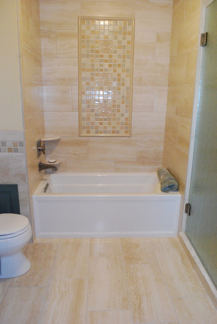
The bath was tiled in a high definition ink jet printed porcelain tile.  The tile is stunning in person and resembles a vein cut travertine.  I designed a custom mural which is framed in above the tub.  My client did not want a piece of art work in the bath so we designed this custom piece as a built in piece of artwork.  It is composed of fired glazed crackle tile which also extends as a decorative border around the rest of the room & throught the custom walk-in shower.


The finishing touch in this bath was the rain glass frameless shower door.  It is absolutely beautiful and catches your eye immediately when you enter the room becuase of how it catches the light.  See below for a list of material information for this project.


Contractor: Dan Savageau Construction
Interior Designer: Sarah Brown
Cabinetry: Decor Frameless Cabinetry from Floor to Ceiling in Fargo
Top: Cambria Quartz
Glass: Rain - Frameless
Tile: Jeffrey Court, Oceanside Glass & Ira


Sunday, February 12, 2012

Kitchen Design

Since it has been extremely frigid I thought that I would share a kitchen I designed that has a warm, bright & cozy feel. The goal was to have the kitchen feel warm while also bringing in elements such as stainless steel, glass & natural maple to help it to lean towards my client's contemporary style.  Like most kitchens this one is also the hub of the home for my client's family so making sure it is a kitchen that functions well with an open plan was of equal importance.


Natural maple is a great wood speices to use if you want a contemporary look but don't want to get a cold feeling in your space.  Pair natural maple with a shaker style flat panel door style like shown and you get a very clean & crisp look that is timeless.  The island allows the space to stay open at both ends for excellent circulation through the kitchen for this busy family.


I love the glass pendants that my client selected and the counter stools provide the perfect finishing touch that adds a splash of color and pattern.  We added the tile backsplash a few months later and really makes the back wall a focal wall and brings the kitchen to a whole new level.


Designer: Sarah Brown @ Floor to Ceiling
Splash: Glass random blend
Tops: Textured HD laminate
Floor: Laminate
Cabinetry: Natural Maple
Pulls: Satin Nickel

Wednesday, February 1, 2012

Favorite Things: Painted Cabinetry

One of my favorite things.......Painted Cabinetry!

Below are some examples that I just love!


Black painted cabinetry can be used in all styles of design.  It can lend itsef to contemporary, rustic, traditonal, formal and much more depending on what it is paired with.  This is an example of black painted cabinetry from my Omega/Dynasty line.  www.Omegacab.com


Also from our Omega/Dynasty line this white painted cabinetry creates a crisp look that bridges traditonal and contemporary design.  I LOVE how white cabinetry creats a fresh look that can go with any other wood species or accent colors for paint, backsplash tile, and even more fun....use a contrasting color for the island as shown in the example above. www.OmegaCab.com


Check out this AWESOME blue cabinetry that was paired with this espresso kitchen.  What a fun way to add a pop of color and create a unique look that no one else will have! www.OmegaCab.com